BlogWhat-if scenarios and empathy matter in user experience design
By the time you’re reading this, the 2020 U.S. presidential election may have already been decided. However, as I write this, it’s a nail-biter, and CNN’s election tracking website is just shy of infuriating.
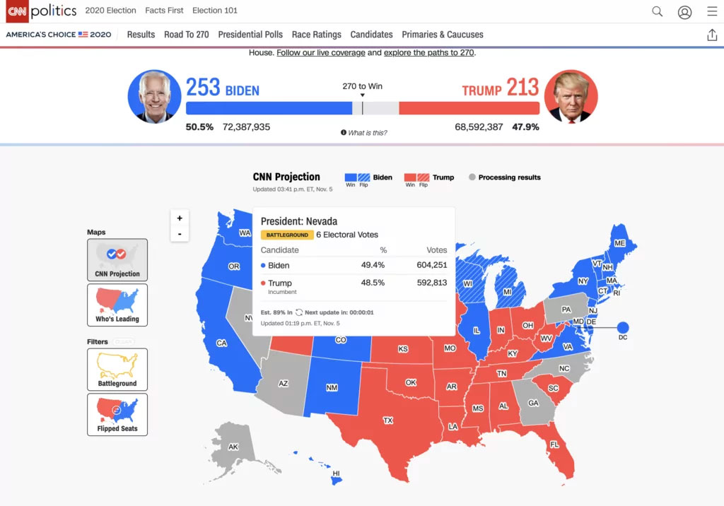
November 5, 2020Let’s take a look and learn a lesson. First, there are many things they got right. Clearly understandable electoral votes tracker at the top, pushing inward to 270. Red vs. blue in the map. Hovering (on a laptop) to view key state-wide stats. Great.
What-if scenarios suppose possible situations where the user finds him/herself while using your product. Consider what conditions can reasonably happen, and how they can change the users’ needs and motivations. From there, how should the user experience design change to accommodate?
For instance, one what-if scenario for this presidential election would be a landslide for either party. Another scenario is that it’s not a landslide, but the winner is clear. In both scenarios, I’d say the above CNN map as-is would do just fine. It shows outcomes per state and eventually the winner.
However, as you know, that is not the scenarios playing out. This election is an incredibly close call, with mere thousands of votes to decide the winner. If CNN had anticipated this what-if scenario, what should change in the design? Well, empathize with me: Let me tell you the mental math I’m doing throughout the day.
I visit the CNN Election 2020 page periodically during the day, and hover over the contested states. The info box displays the number of votes for each candidate. However, now the percentage is much less important because it’s so close. Instead, I want the delta in vote counts, and the info box doesn’t calculate it….so I’m doing math in my head! In this what-if scenario, my motivation changed from seeing who won to seeing how close the counts are.
Then later, when I check back on the CNN page, I can’t remember what the previous vote count was for each candidate in a given state. Has one candidate’s lead become wider or narrower? I want a chart that shows the number of votes tallied over time. Without this, I have to remember what the previous count was when I last visited (which I had to calculate in my head previously), and again do the math.
I could go on: For instance, what states are nearly finished counting votes? One state is 89% reporting, another 94% reporting, another 98% reporting, etc. The map should indicate that immediately now, since beyond the vote count, that’s the next question on everyone’s minds.
What-if scenarios establish empathy
When designing a product, especially one in a mission-critical situation such as a general election, it’s worthwhile to suppose what can conceivably happen (within reason), and then empathize with the user in each scenario. “If the election is very close, what is the new motivation of the user? What does s/he want to know immediately on every return visit to our site?”
It’s possible to build this into the design as a contingency, even enabling new capabilities when the situation changes. For instance, the features I just described could exist secondarily, and then be brought to the forefront when the election conditions change to become so close.
Now if you’ll excuse me, I have to visit CNN’s website again and do some math.
Don't miss out on the latest insights and trends in UX design and AI research! Subscribe to our newsletter.